Quantum Design System

As 2020 came to a close, it was clear that our dashboard was becoming both visually and structurally out of date. With a rebrand imminent, I was tasked with designing and documenting a new design system for our Dashboard.

Say hello to Quantum.

  • Type

    Design system

  • Timeline

    Oct 2020 -> Mar 2021

The problem

For over four years, the Auth0 dashboard remained the same, seeing minimal changes in that time period due to hypergrowth and a focus on building out new features. With no proper documentation, patterns were becoming inconsistent, navigational IA was becoming clunky, and ultimately the dashboard was feeling outdated.

Our goals

At the end of 2020, the visual design team set forth on providing a company-wide rebrand. As a part of this rebrand, the product design team took this time to explore new navigational IA and provide the dashboard with a much needed facelift. I set out to pair with members of the visual design team to define how the new branding translated into our product and ultimately provide both documentation and a Figma component library for our designers — Something we desperately needed. Our goals were to:

  1. Find ways to tie the new company branding to our dashboard.
  2. Provide go-to resources for designers and developers to enforce consistency.
  3. Increase designer productivity by decreasing the time it takes to design dashboard mockups.
  4. Decrease inconsistency between interactions and components across the dashboard.

Foundations

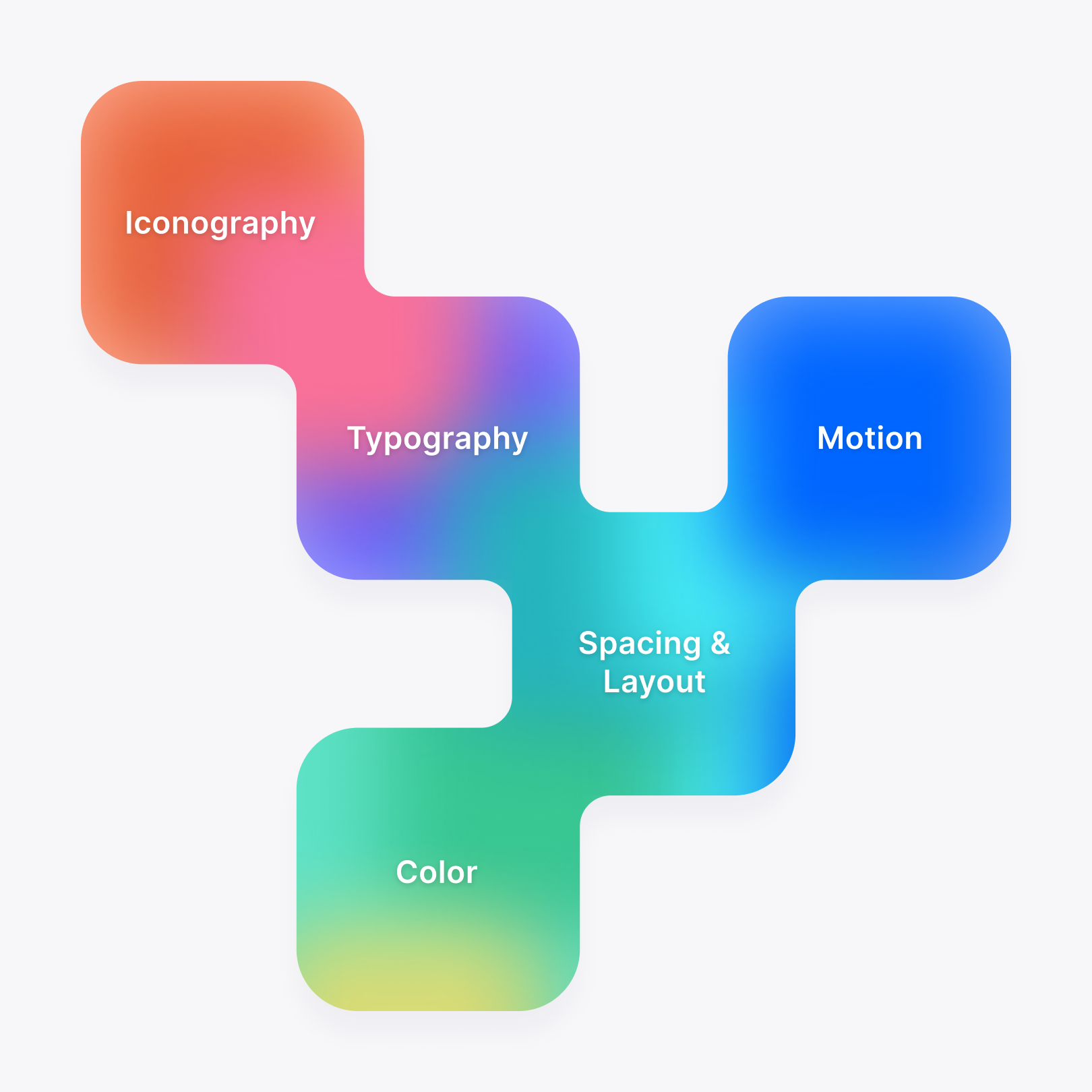
Foundations are the core building blocks of the design system that would enable us to create usable and meaningful components and patterns that also tie to our company values. Working with members of both the product design and visual design teams, we defined the foundations as encompassing color, typography, iconography, spacing & layout, and motion.

Color At Auth0, we use color as a way of communication. Our carefully chosen colors drive the creation of patterns that make it easy for users to navigate, understand, and return to without the expectation of needing to learn something new.

Unlike the existing system, we wanted to ensure that the colors we chose would comply with WCAG 2.1 AA standards. In collaboration with the visual design team, we devised a set of colors that existed as a subset of our brand colors, which would provide accessible and meaningful colors to our design system. Each set of colors had a base color that was generally the most vibrant color while remaining accessible, as well as three lighter and darker shades for a total of seven colors per set. These colors would provide solutions for the user interface as well as illustration.

Typography Our font and type scale are derived from function. Our carefully crafted set of typographic styles combine style and purpose to create visual patterns for the many hierarchical functions throughout our experience.

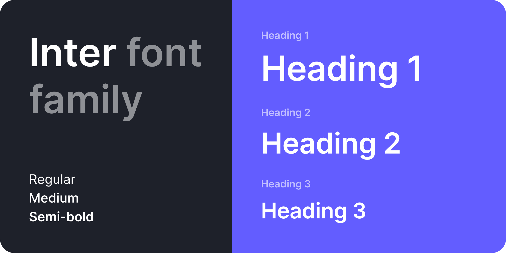
From a typography standpoint, our dashboard tended to lack a sense of hierarhical structure on a page-to-page basis. Of course, there was no documentation on how or when to apply certain heading styles over others, which created inconsistency throughout the experience. To add to this, heading font sizes were created based on what looked good, lacking any rhyme or reason. We took this time to develop a new type scale based on a 4-point baseline grid, providing us with several heading values for all situations across the dashboard, including more intricate documentation. We also moved away from px units and opted for em — a better unit for providing a more accessibile experience.

Spacing & layout We use a combination of spacing and layout to create consistency and balance within our user interface, resulting in a much more legible experience.

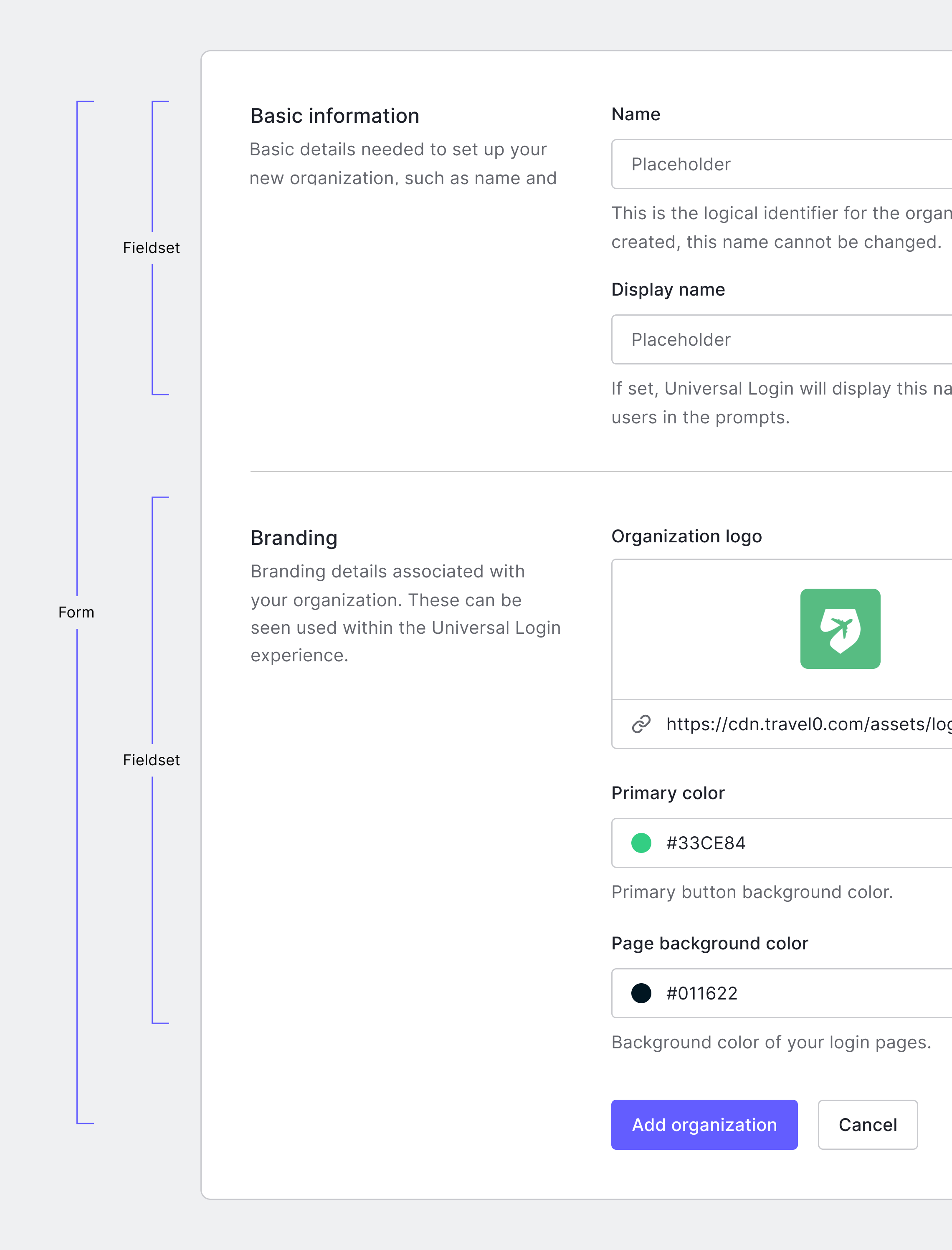
While we already leveraged a spacing system based on multiples of 8, the key here was ensuring that we could document how to properly apply these spacing units as well as the common layouts found throughout the dashboard. We documented a set of spacing values ranging from 4 -> 64 and heavily relied on Gestalts concept of proximity to guide designers on when to use larger or smaller spacing units, expanding on topics such as contextual density and how these may apply to common situations such as layouts and components.

Components & UI Kit

With our foundations defined and documented, it was time to shift gears and focus on applying these newly formed foundations towards a brand new component library. An audit was performed on the existing dashboard to help devise a prioritized list of components and help find areas where we could reduce or improve the components offered.

Components were designed using the foundations at their core — most notably color, typography, and spacing. Each component was designed in Figma using Auto layout 2.0 (pre-variants) to ensure their behavior matched that of their coded counterparts, such as resizability, making them much easier for designers to use. Each component also included all applicable states, such as rest, hover, focus, press, disabled, and error.

When pieced together, our designers would be able to create more beautiful, memorable, and consistent experiences for our users in a much more efficient manner.

Results

A designer enablement session kicked off the initial launch of these efforts internally. We stress-tested the kit and made changes as needed, using Figma’s analytical tools to help better understand which components were getting the most use and which were proving to be hardest to work with.

Prior to the launch of the new design system, and over the course of a month, we asked designers to track the length of time it took for them to create their designs and put together a high-level "average". Similarly, post-launch and over the course of a month, we asked designers to once again track the length of time spent creating designs. Although this data does not take several factors into account, we ultimately noted a significant decrease (24%) in the amount of time it took for designers to complete designs, with the general sentiment from designers and managers that having reusable Figma components and documentation to reference vastly improved the quality of design and the speed at which they work.